charts
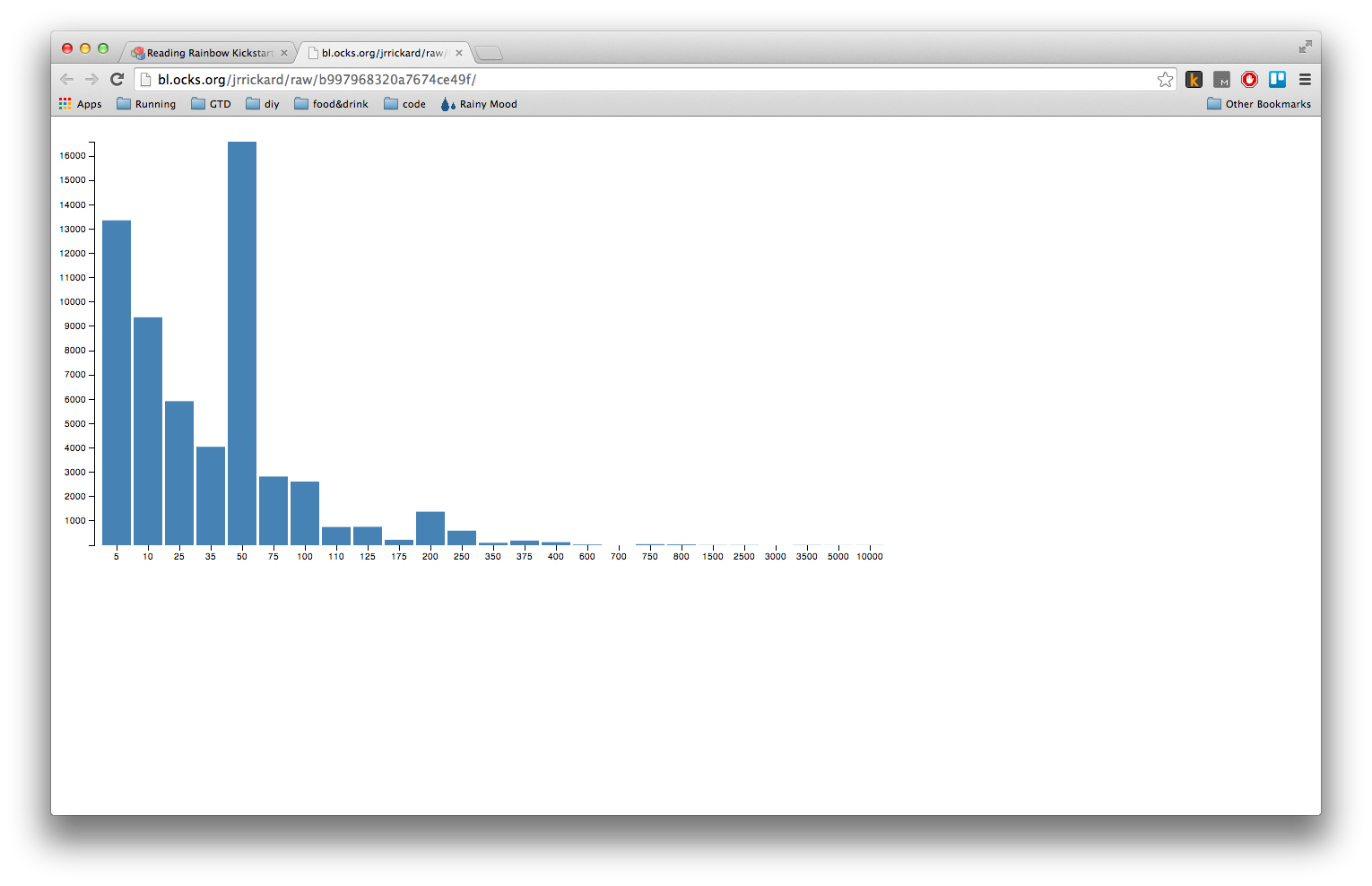
I’m going to be doing a D3.js related tech talk at work at the end of July, so I’m building up a set of examples. Three days ago, I saw a kickstarter campaign to “bring back” Reading Rainbow. As of today (9:51 PM MDT…05/30/2014), they’ve almost passed 3 million dollars.
I was curious where the backers clustered (many small backers? even split?) so I did made a quick bar chart of pledge amount vs backer count using D3.
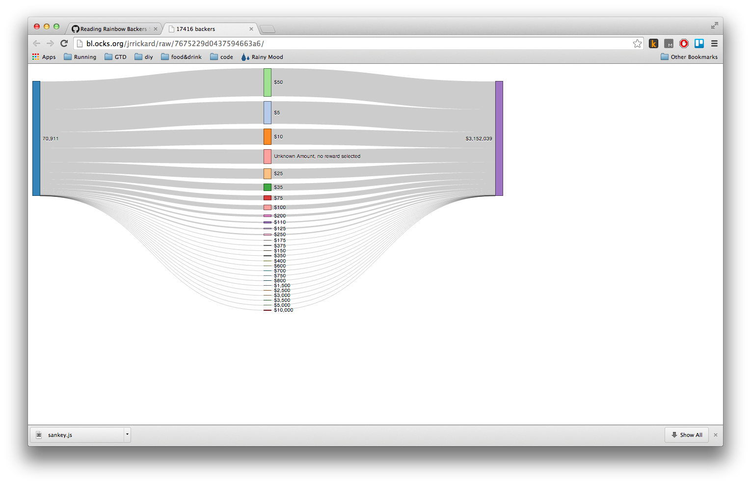
As an update, I grabbed the data again and made a Sankey diagram.